Outsource, a data-driven PR and Corporate Communication agency, marked its 30th anniversary in 2023. To celebrate this milestone they embarked on a comprehensive transformation of their visual identity. At Outsource, trust in data over guesswork is a core belief. The decision to rebrand the identity aimed to convey this unwavering commitment. Recognizing that the existing logo and branding no longer captured the essence of the company, a clean slate became imperative.

Follow the arrow
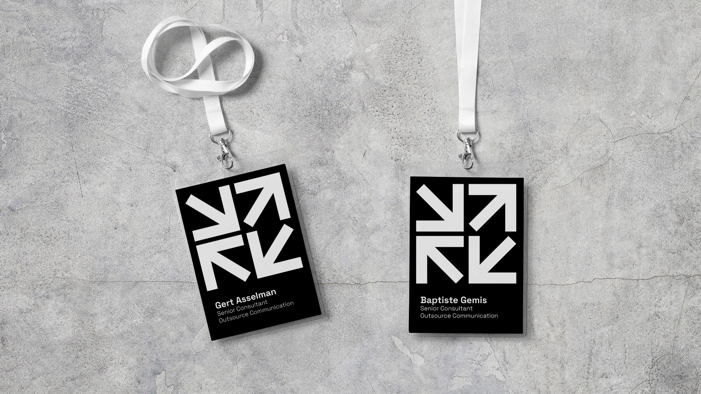
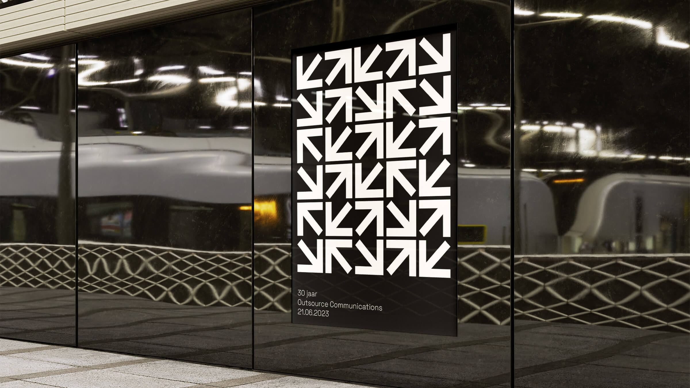
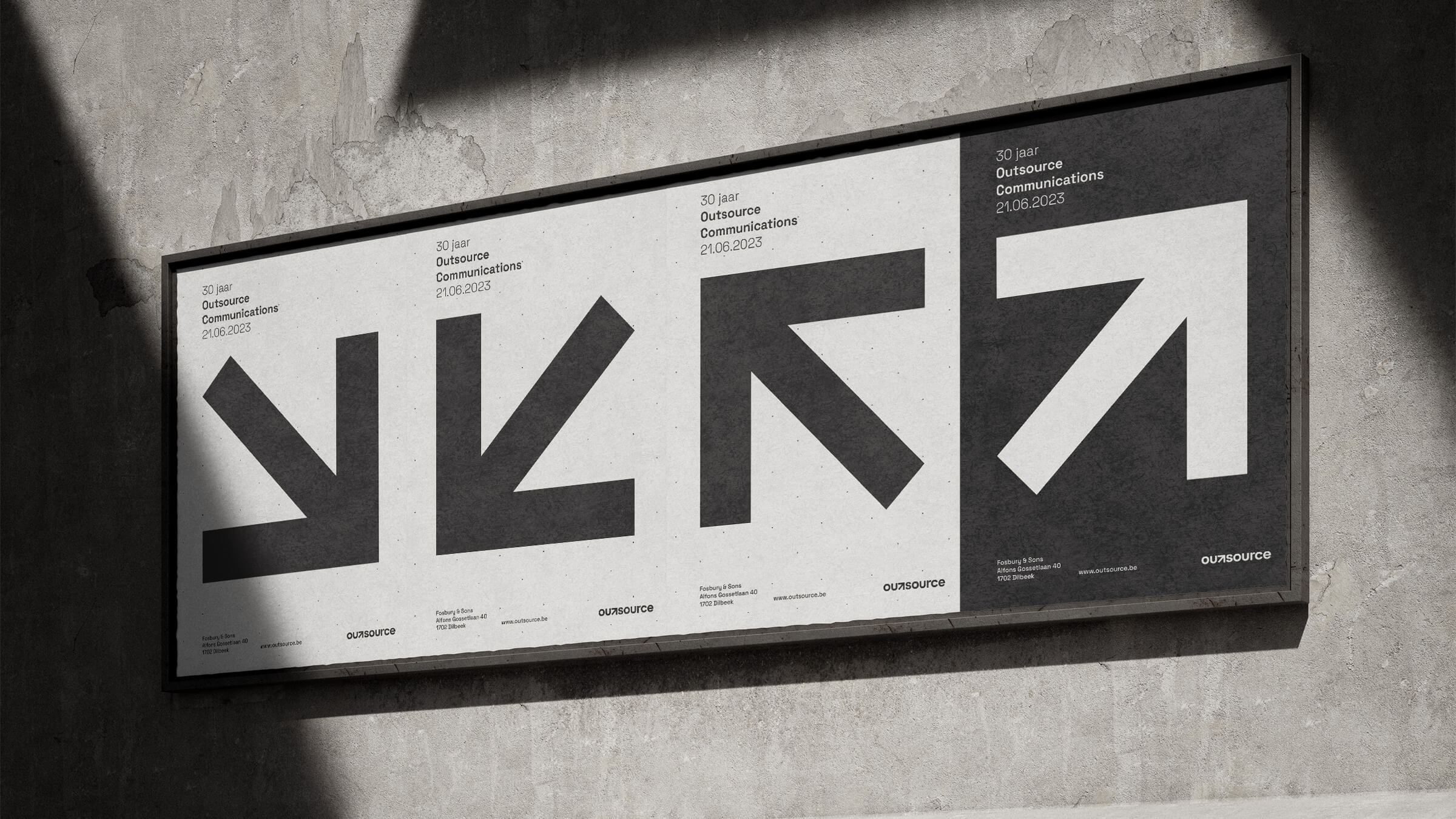
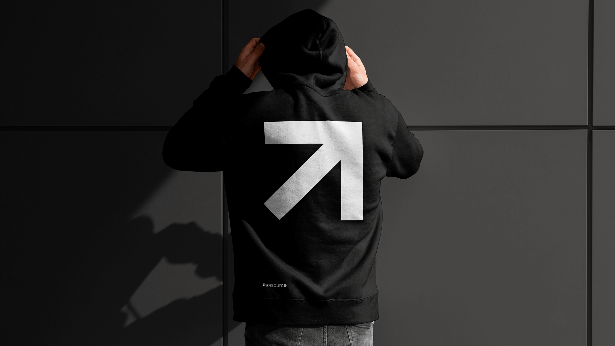
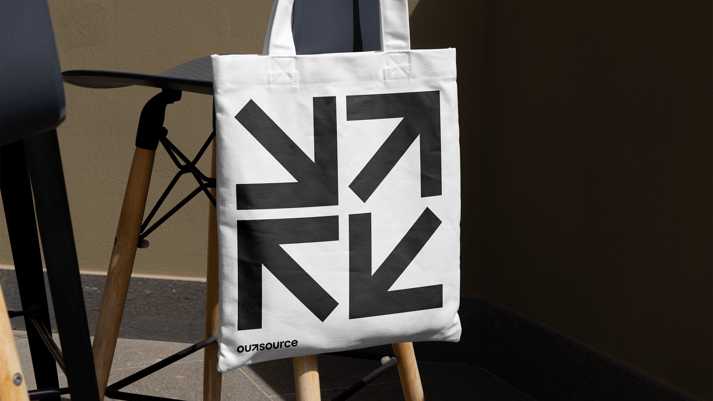
Data is knowledge and knowledge is power. The new wordmark exudes strength and confidence, effectively communicating Outsource's data-driven approach. Seamlessly integrated into the wordmark, the arrow symbolizes guidance and forward-thinking, encapsulating the essence of Outsource in a simple, memorable, and instantly recognizable icon. The arrow stands as the linchpin of the identity system, embodying Outsource's commitment to clarity and progress.
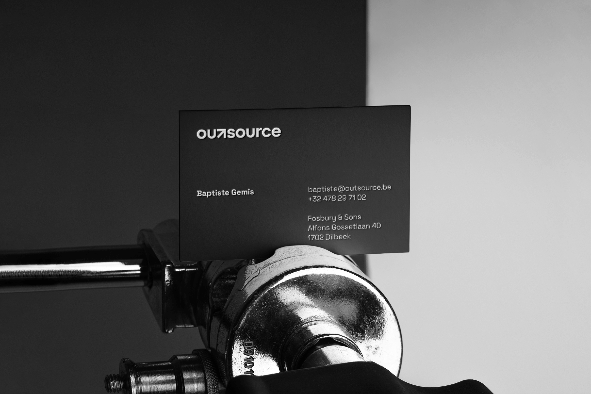
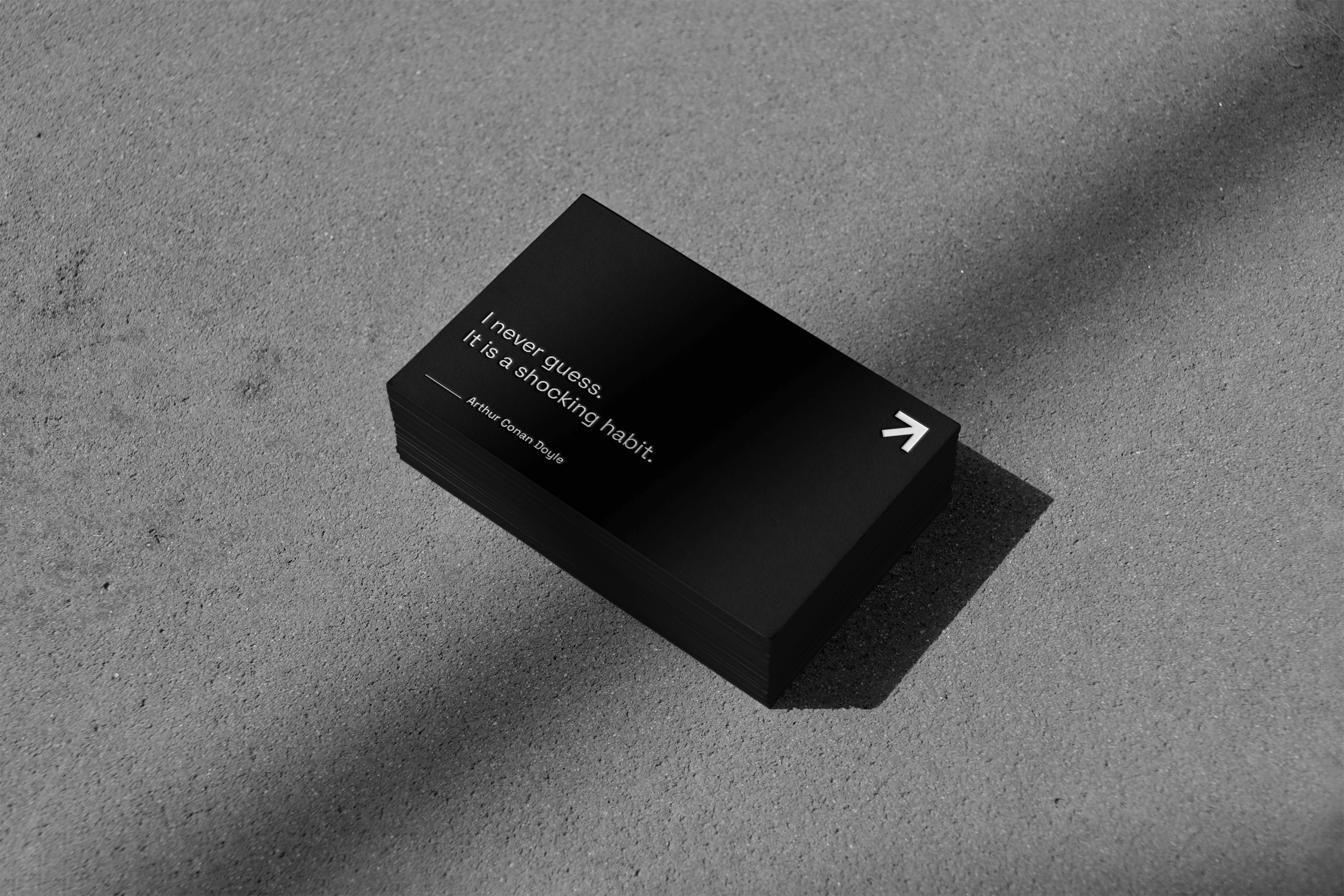
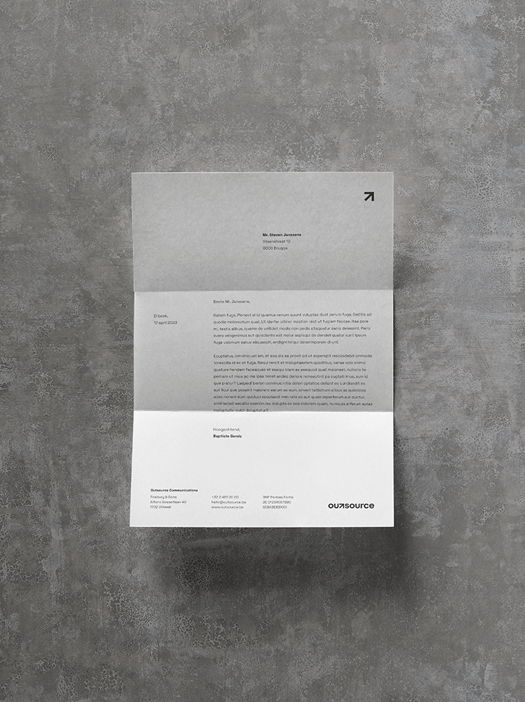
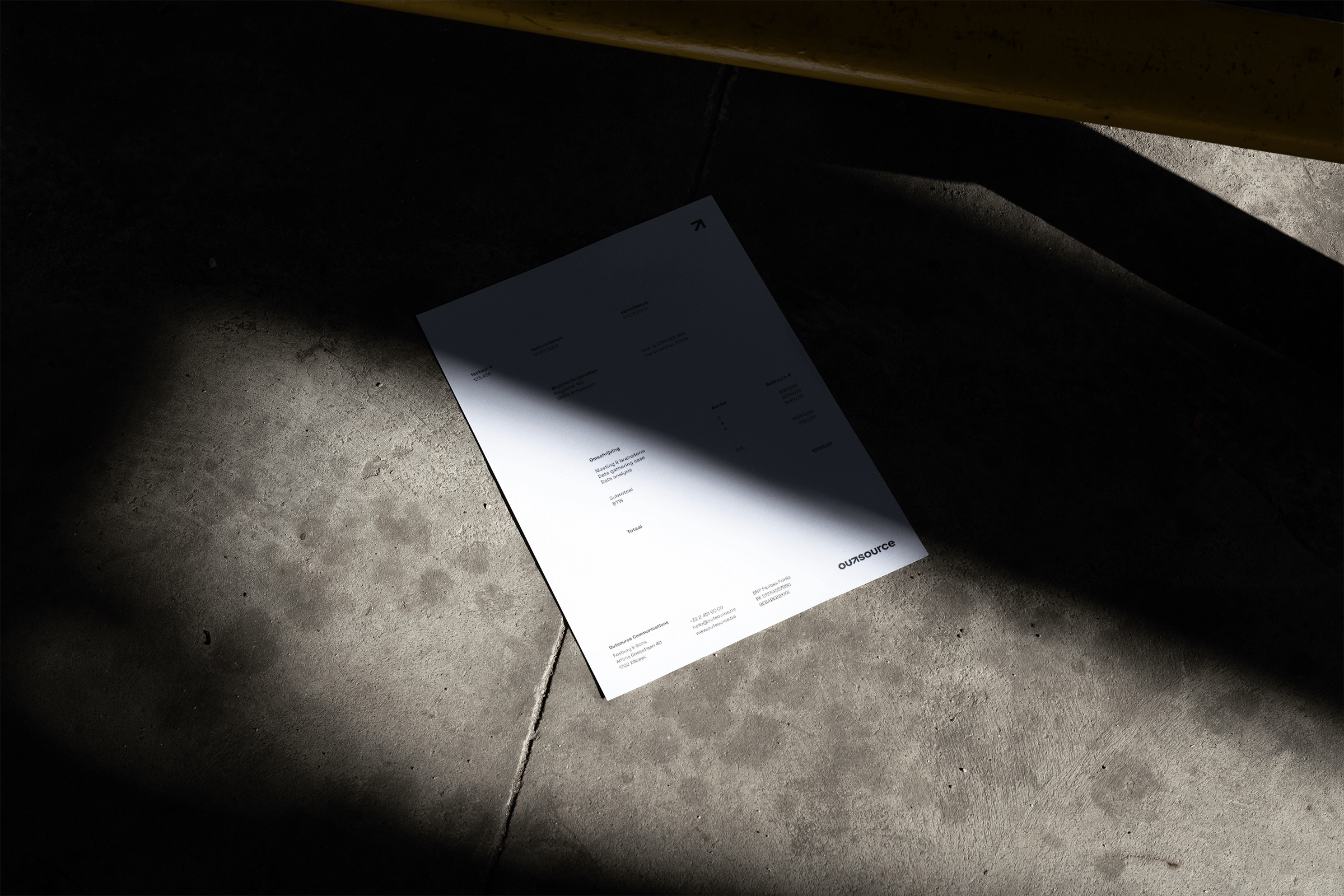
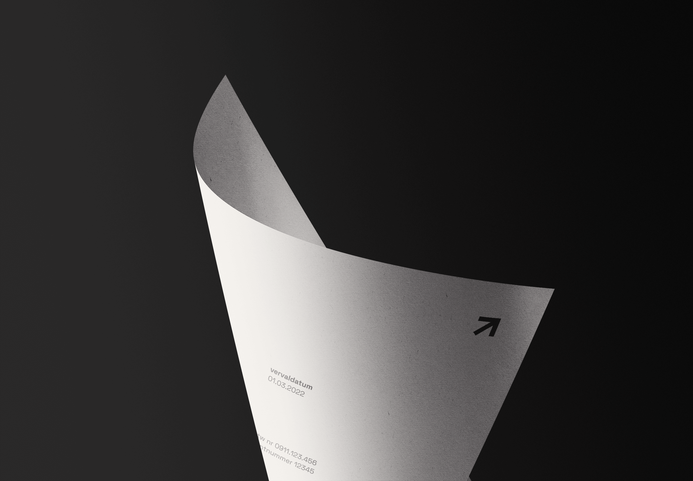
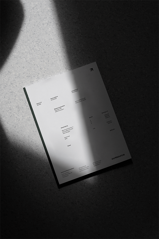
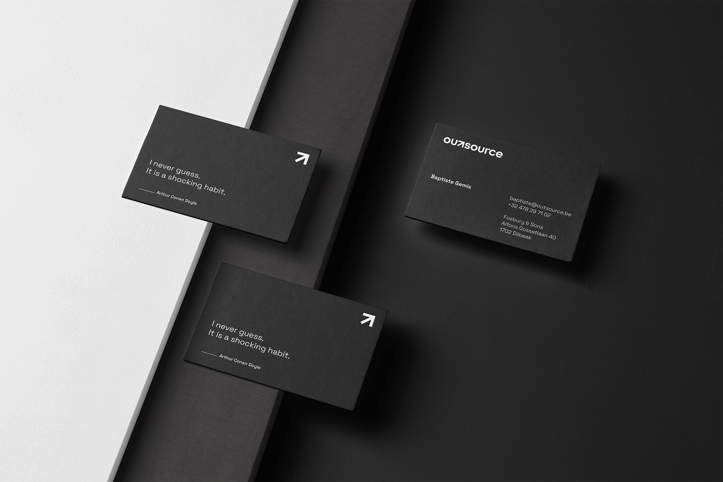
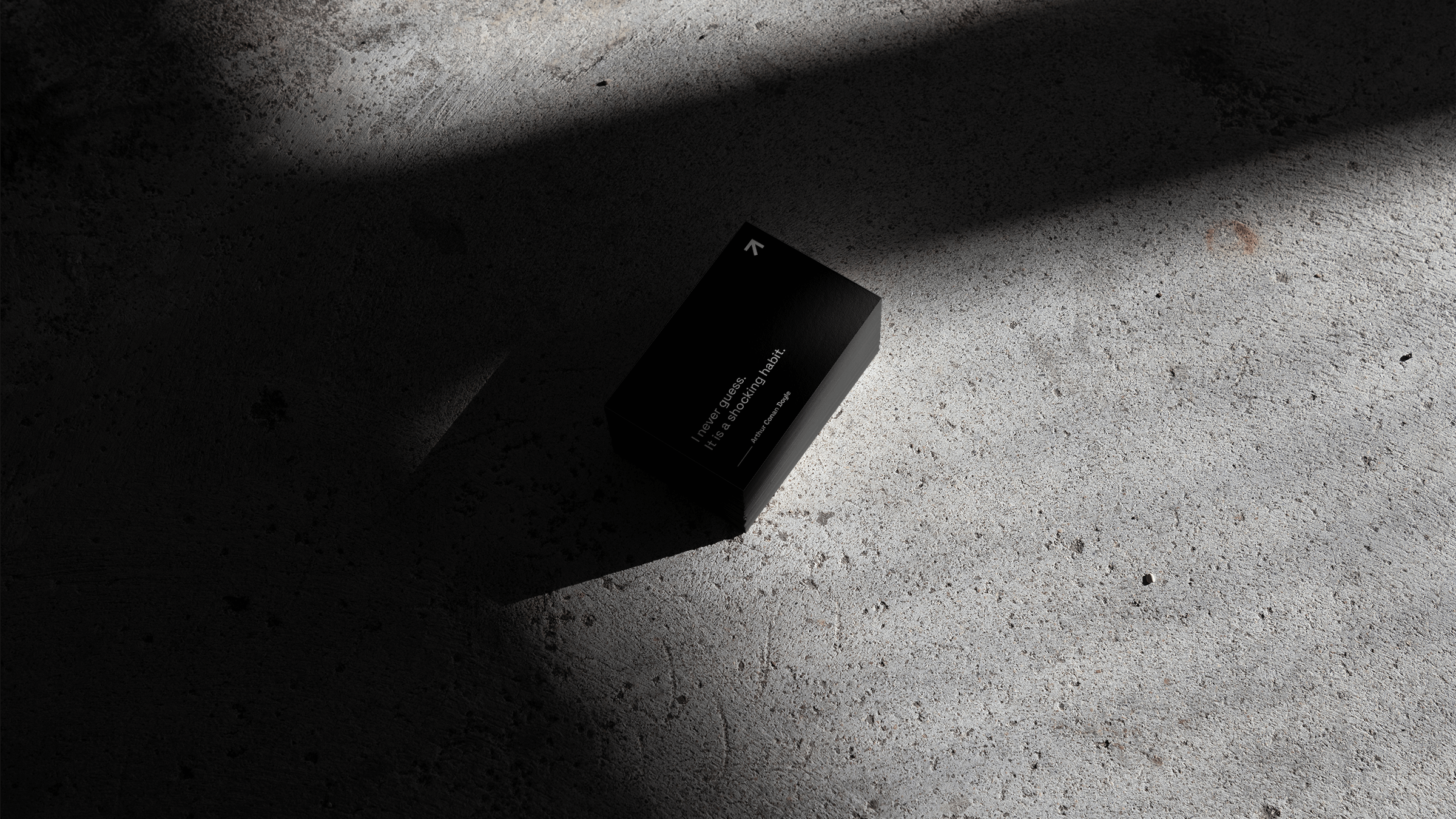
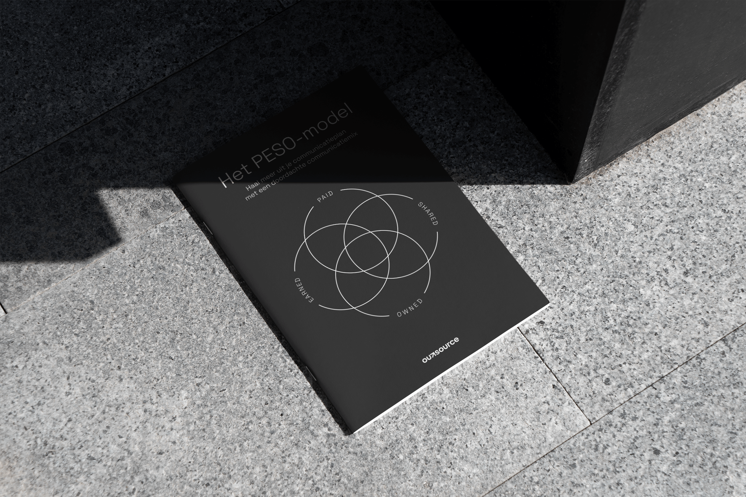
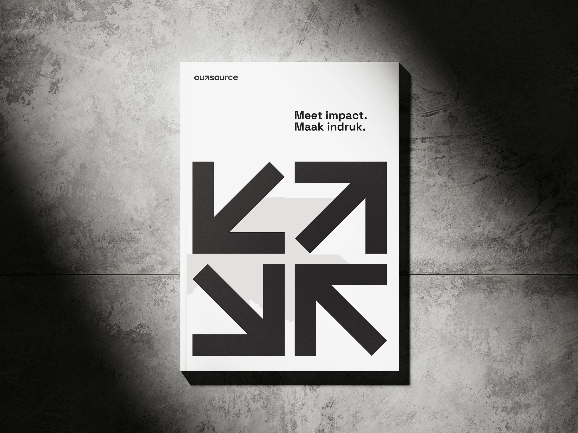


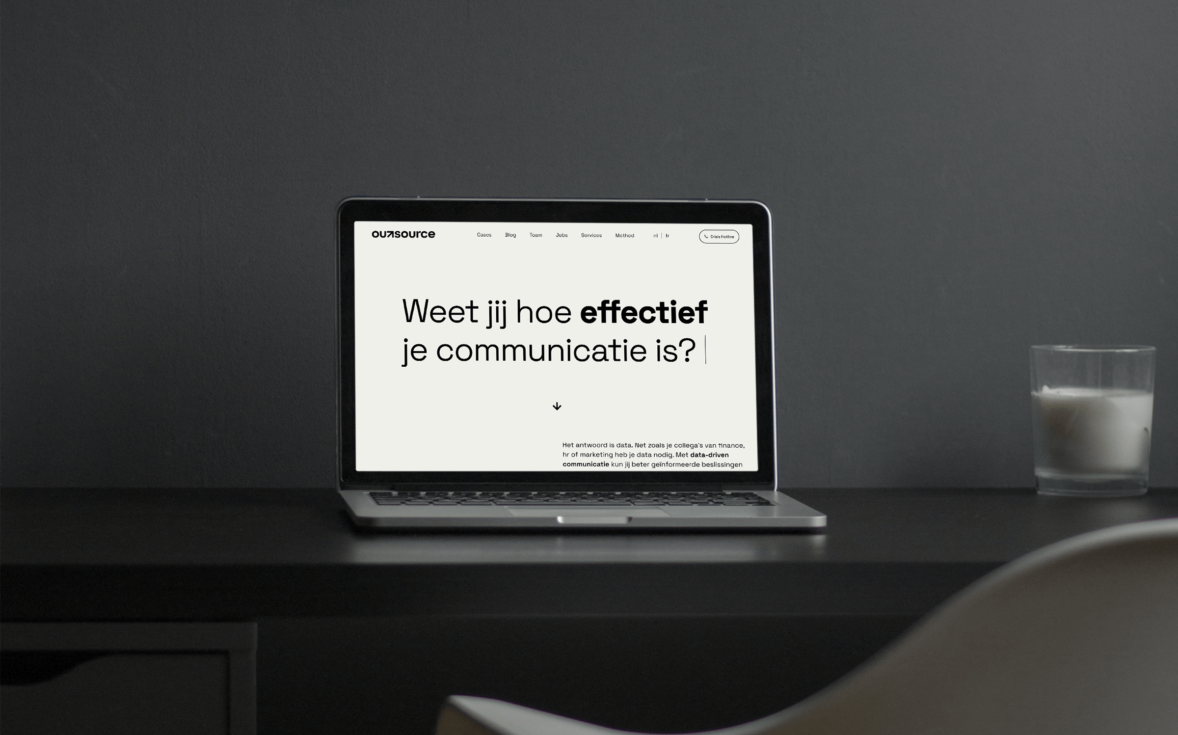
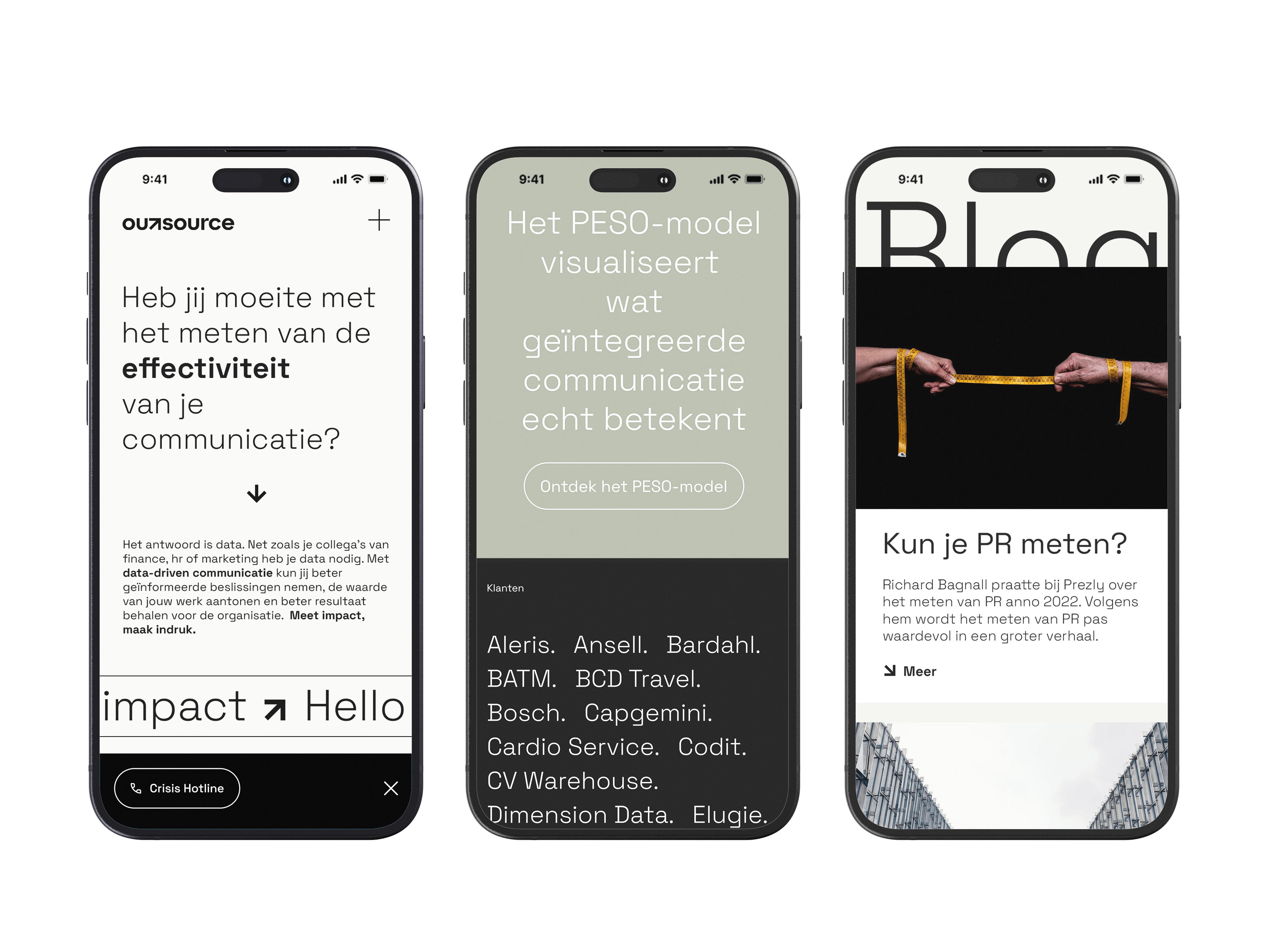
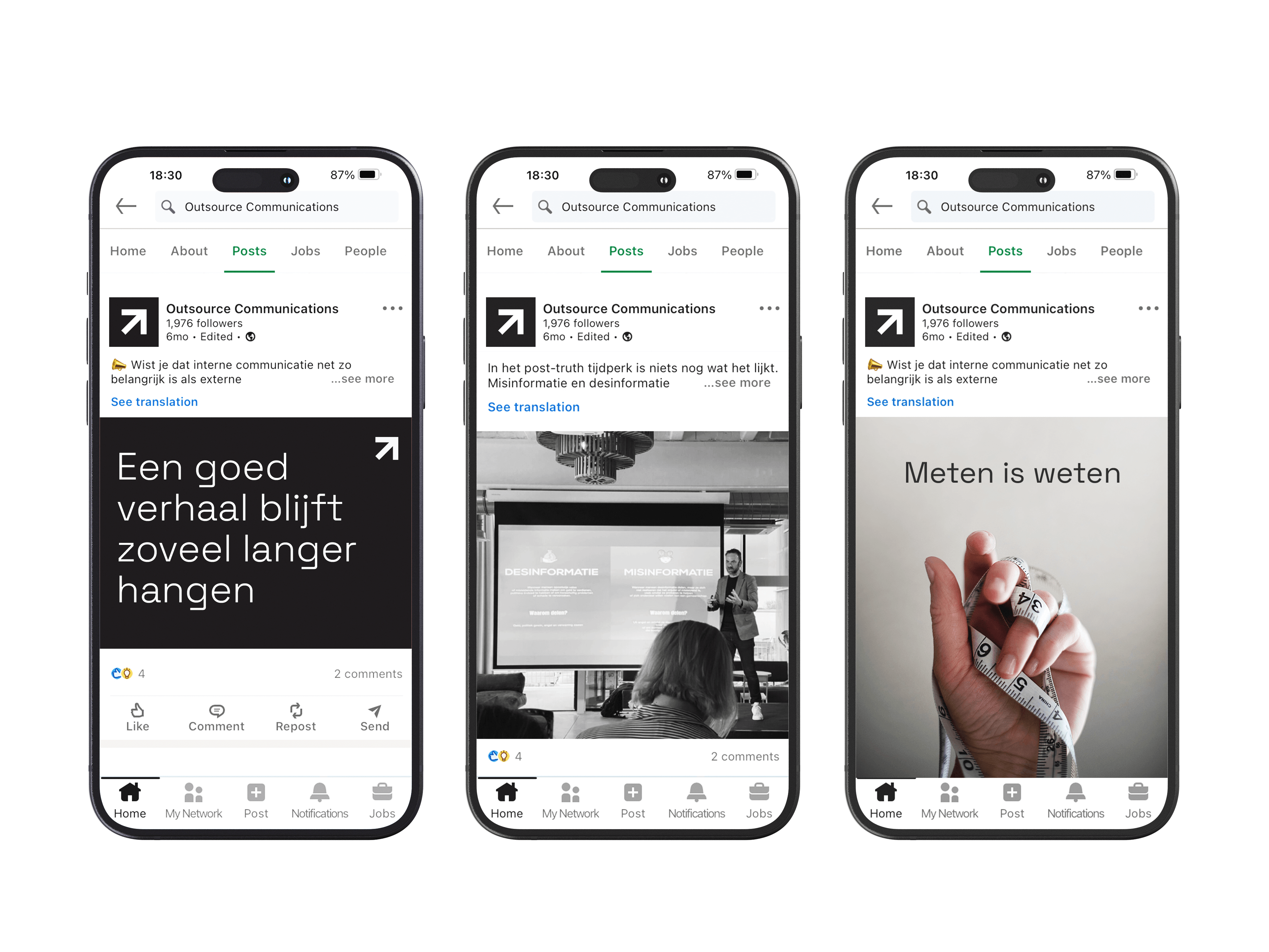
It's often said that a picture speaks a thousand words. However, the people at Outsource possess the power of words to paint a thousand pictures, each one telling a unique story. I chose to amplify their messages through bold typography, ensuring that every word commands attention and conveys significance.

Raas Van Gaverestraat 118
9000 Gent
+32 475 56 89 74
Publications
Idn Magazine
Pencilcase Magazine
Chois Gallery
Good Idea 3