Laying the foundation for the community
As Belgium's largest football club, Club Brugge not only plays a pivotal role in sports but also holds significant importance in the social sphere; using the power of football for good. Club strives to be inclusive and open to everyone, irrespective of their origin, beliefs, or social background. Through its Foundation, Club Brugge seeks to emerge as a prominent influencer in community-building initiatives, positioning itself as a vital social partner in society.

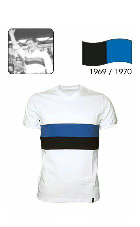
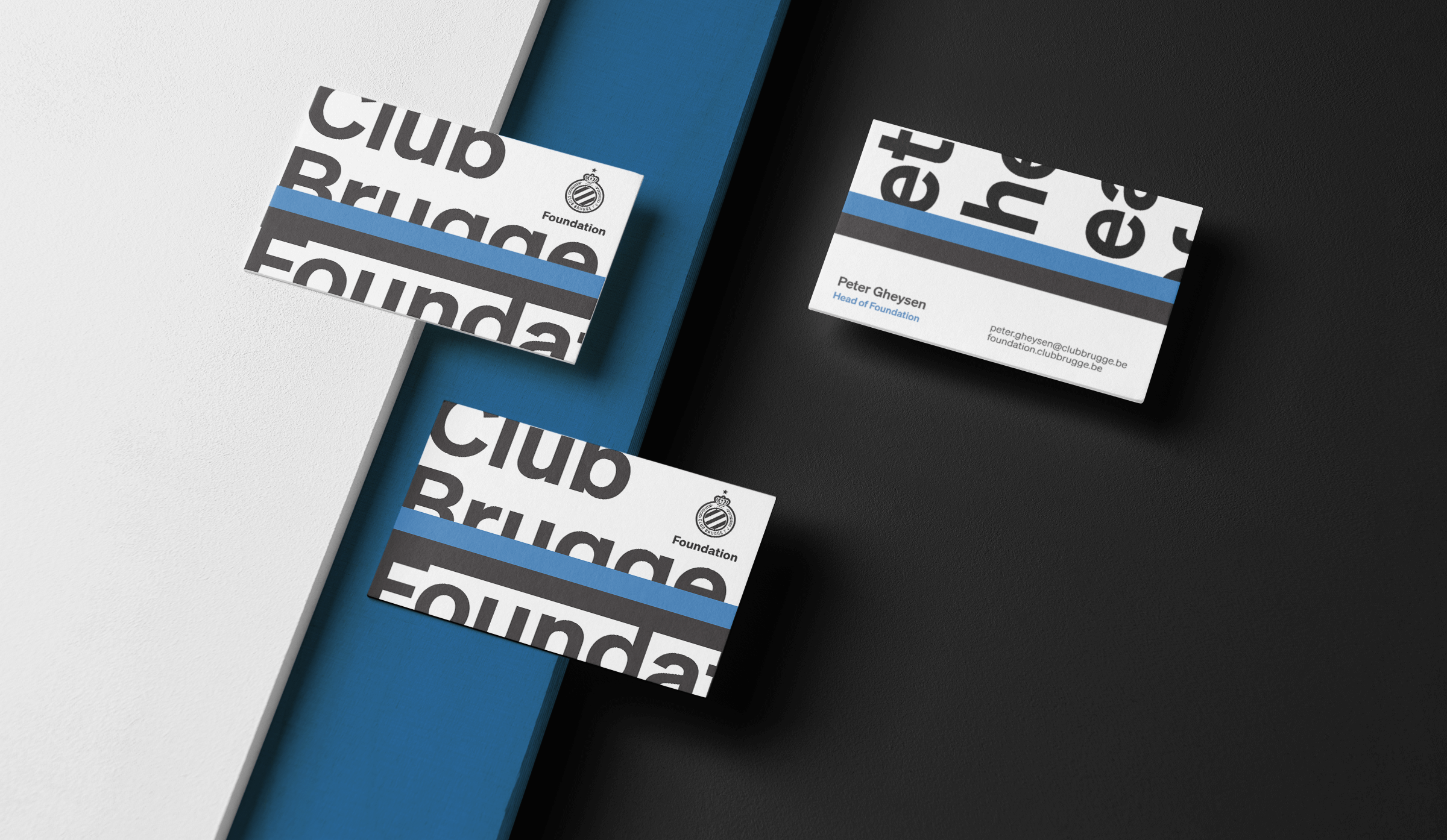
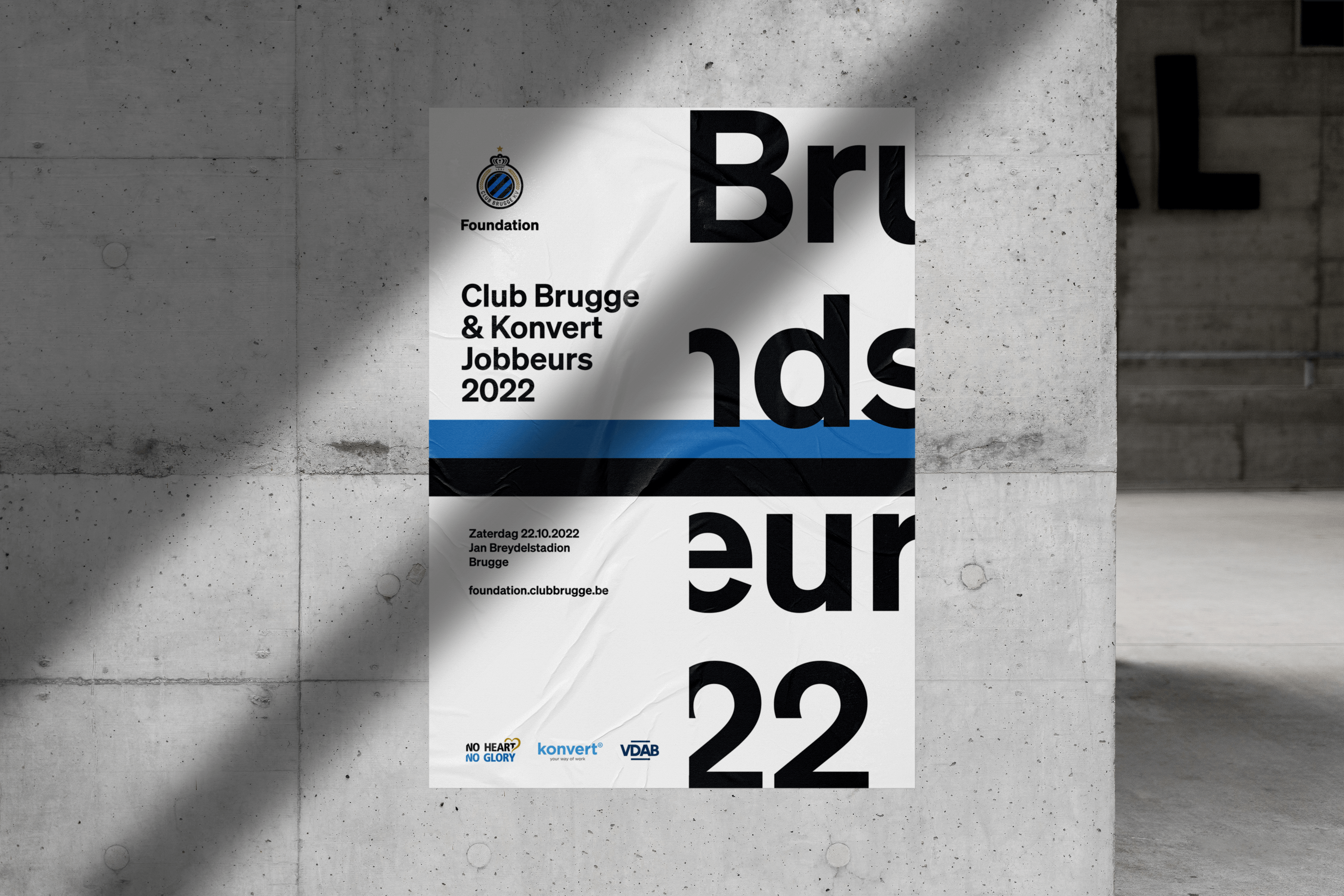
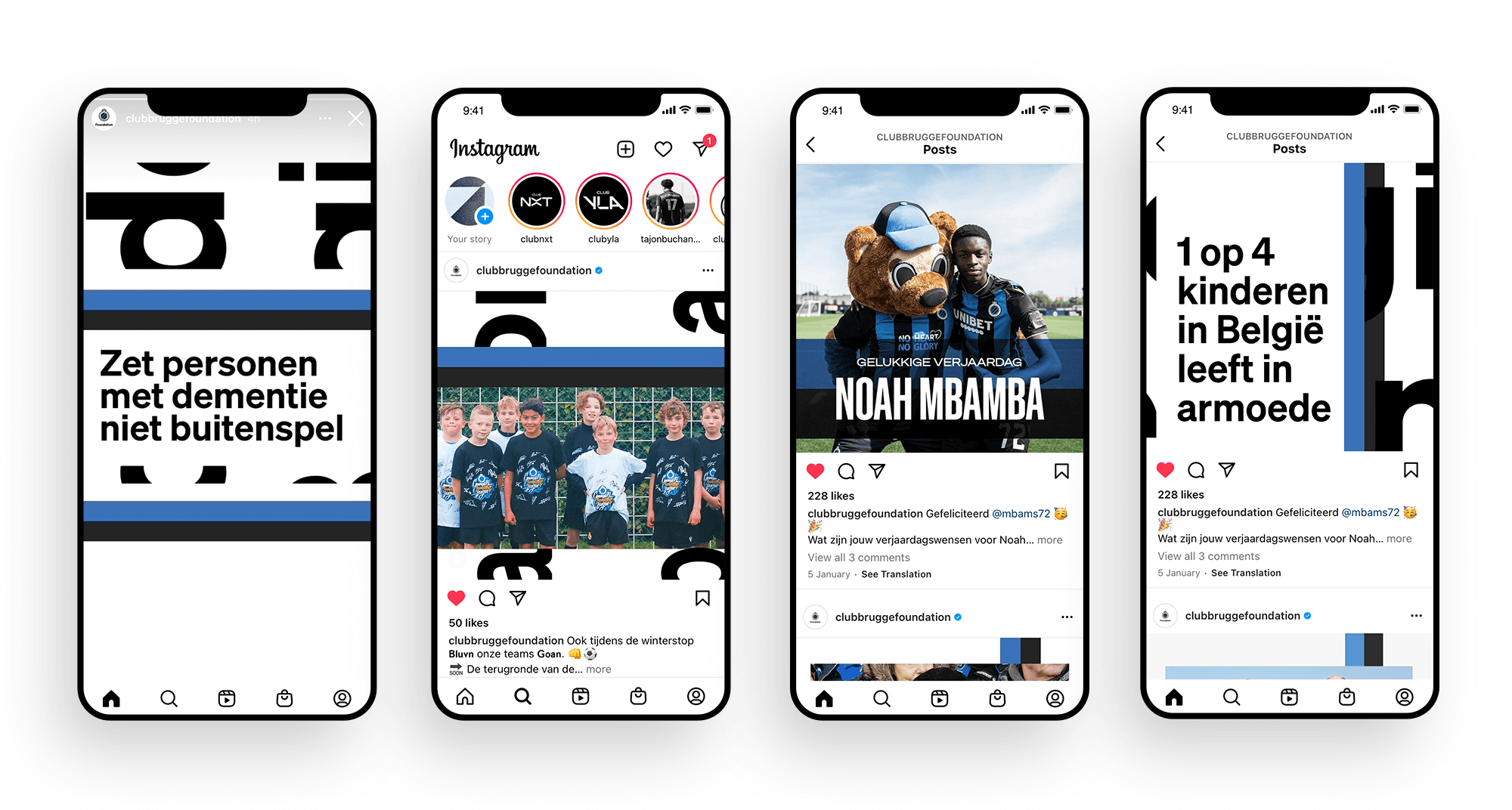
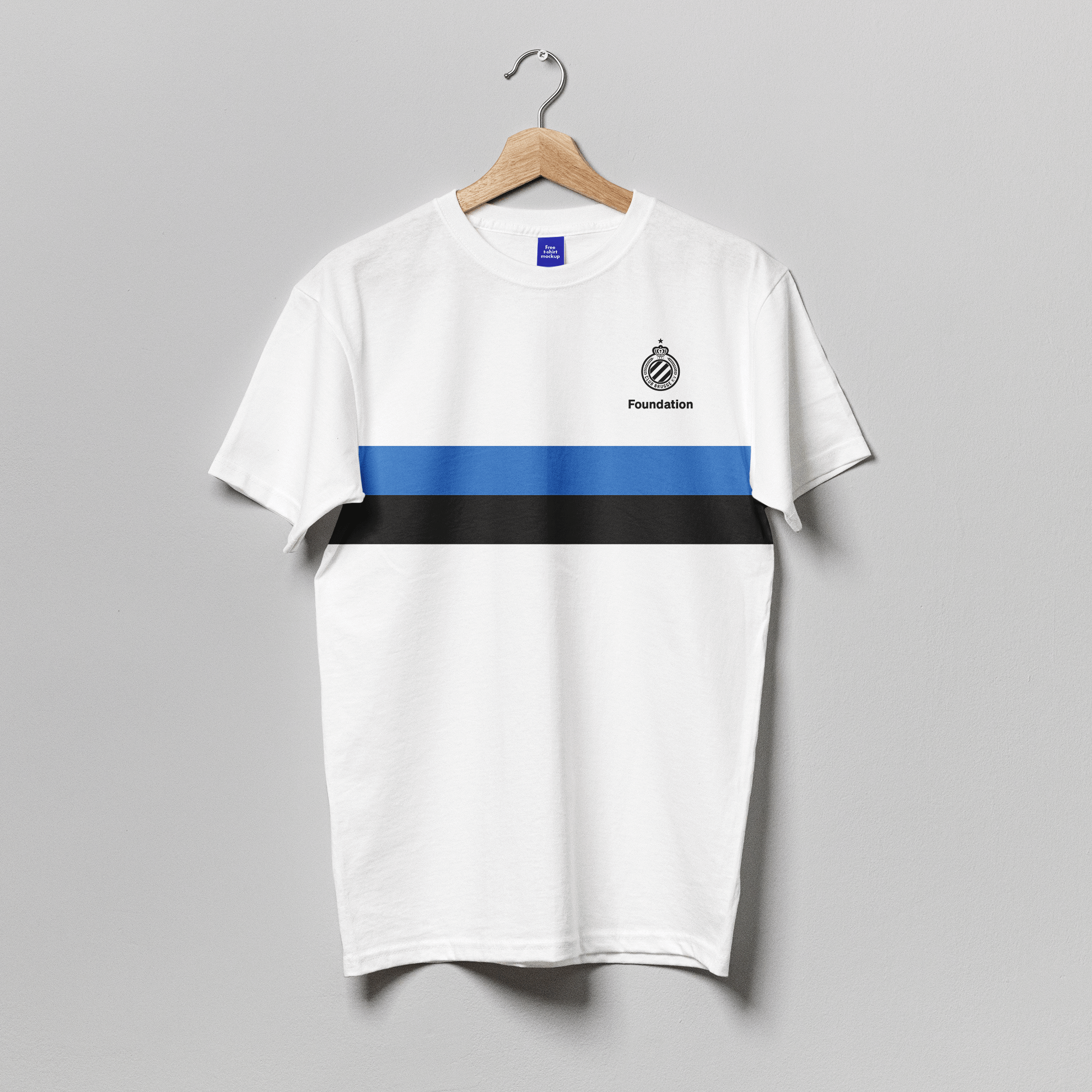
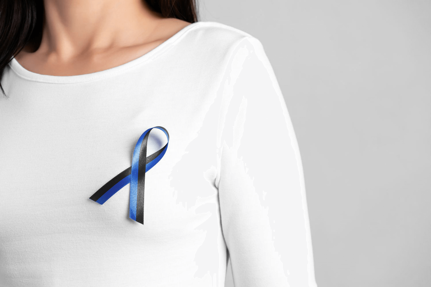
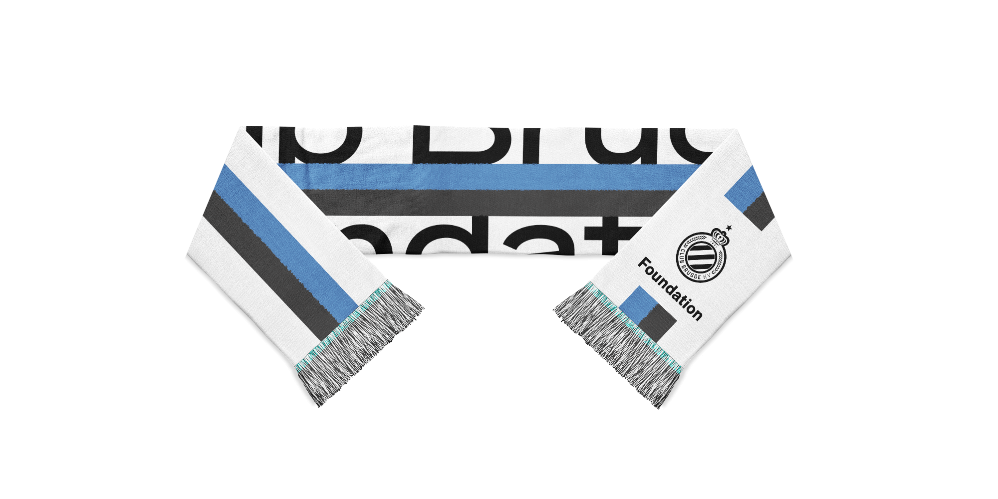
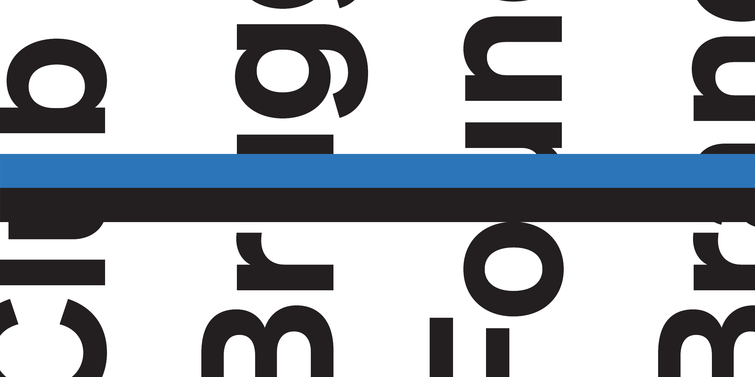
To draw inspiration, I explored the extensive archive of Club Brugge. The white shirts adorning blue-black horizontal stripes from the 1969-1970 season were not only aesthetically pleasing but also served as a meaningful graphic element around which the visual identity could be crafted. The blue-black ribbon serves to connect and unify, while the large typographic blocks symbolize a dialogue with the community, adding a contemporary touch and contributing to an unconventional identity.
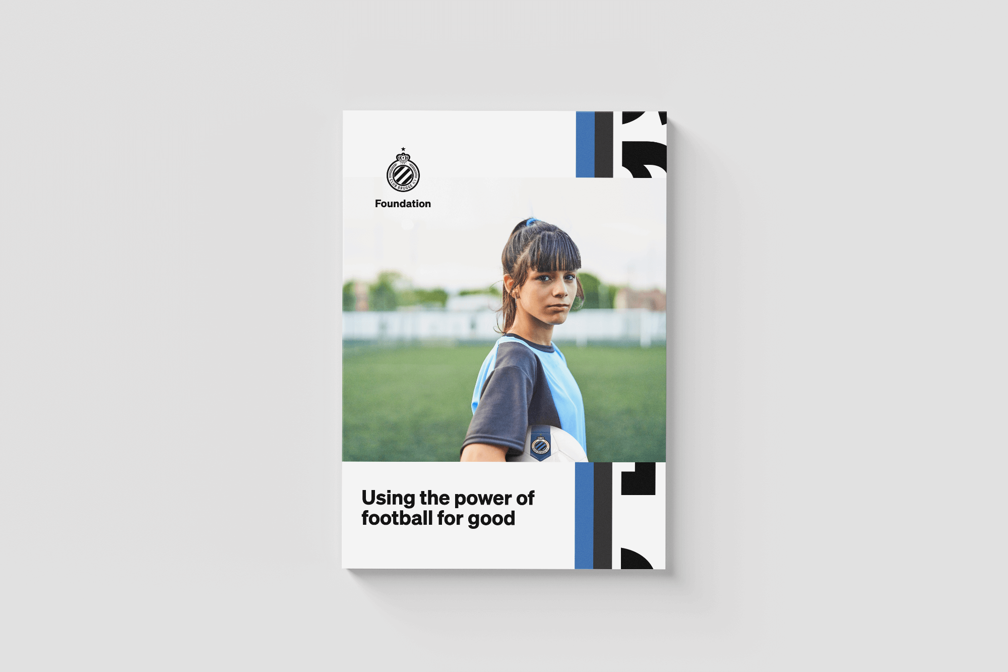
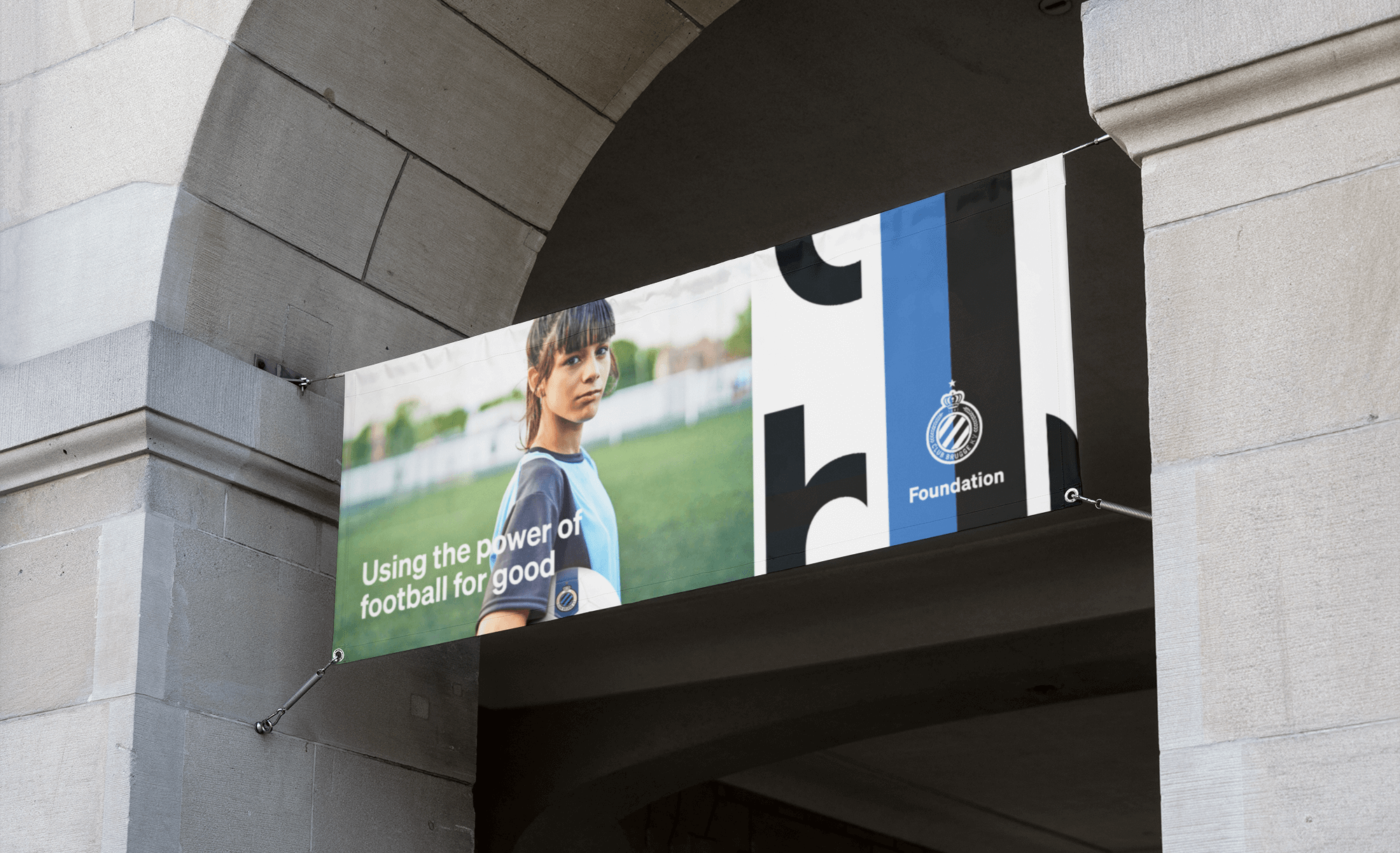
Using the power of football for good.
The Foundation serves as a thought leader, actively participating in discussions on pressing issues such as diversity, inclusiveness, healthy lifestyles, and the promotion of a growth mindset. It strives to unify and engage. Additionally, it applies the role of football in setting and surpassing goals, contributing to personal and collective achievements. We aimed to provide the Foundation with a suitable identity system that conveys these goals and values in a contemporary and visually appropriate manner.
Raas Van Gaverestraat 118
9000 Gent
+32 475 56 89 74
Publications
Idn Magazine
Pencilcase Magazine
Chois Gallery
Good Idea 3